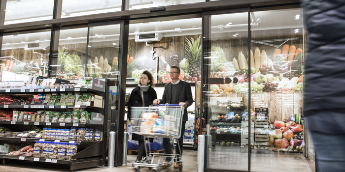
The store is largely made up of low racks, with large, clear signs for easy navigation. A café at the center of the store provides a place where customers can take a break, geta coffee or simply get their bearings, and its central position puts a sense of calm right in the heart of the store. The information desk and the checkouts are next to the entrance and exit, creating an easy access point for customers, as they locate them the minute they enter the store.
The store is not only easy to navigate, it is also a comfortable environment to shop in. The shopping area is enhanced by reducing the cold shopping areas by about 50%. Only items that really need to be kept cold are in chilled areas, and these are separated from the main shopping area with insulated automatic entrance and exit doors. The automatic doors guide customers through the chilled areas, preventing congestion and unnecessary opening. This means customers are more comfortable while they shop and are therefore likely to stay longer.
As Andreas Prehal tells us, “before we had a standard cash & carry market, now we have a shopping experience.”


